The lovely people at global mapping tech giant, TomTom, got in touch with me from their global HQ in Amsterdam. They were having a massive global conference on the future of mapping data and it's possibilities for industry and society as a whole. The centre piece of which was a 45 minute documentary that they were in the process of making.
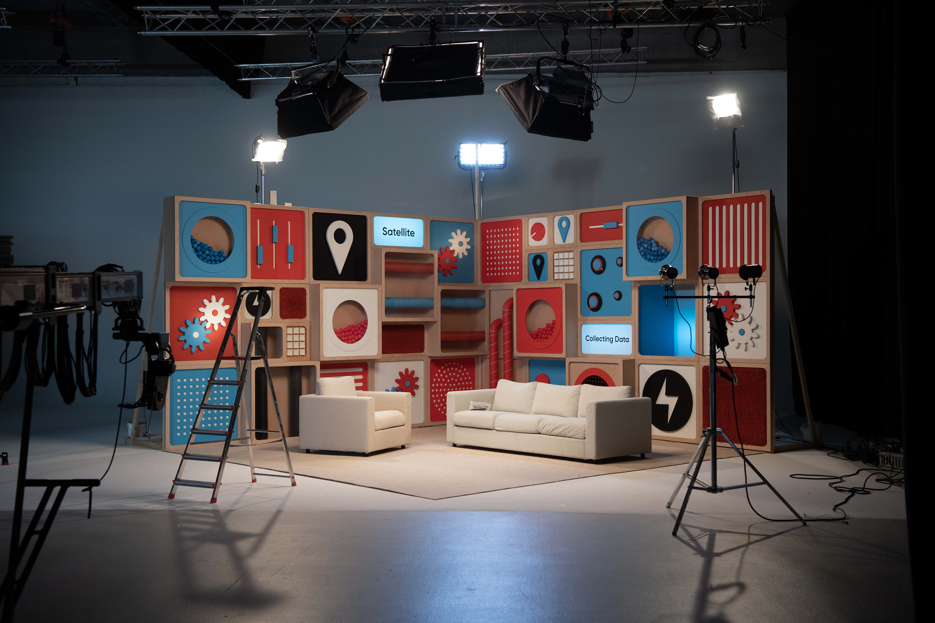
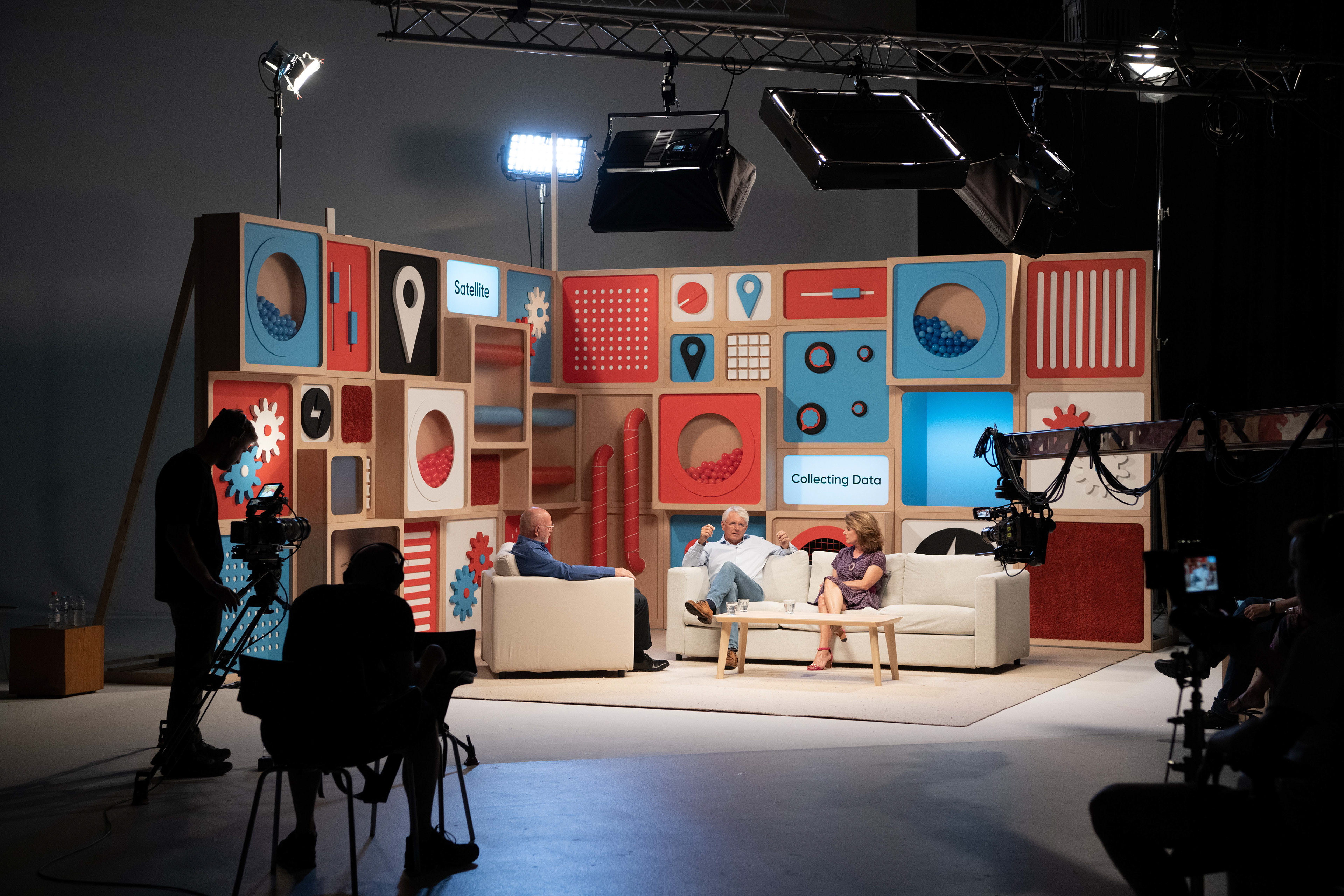
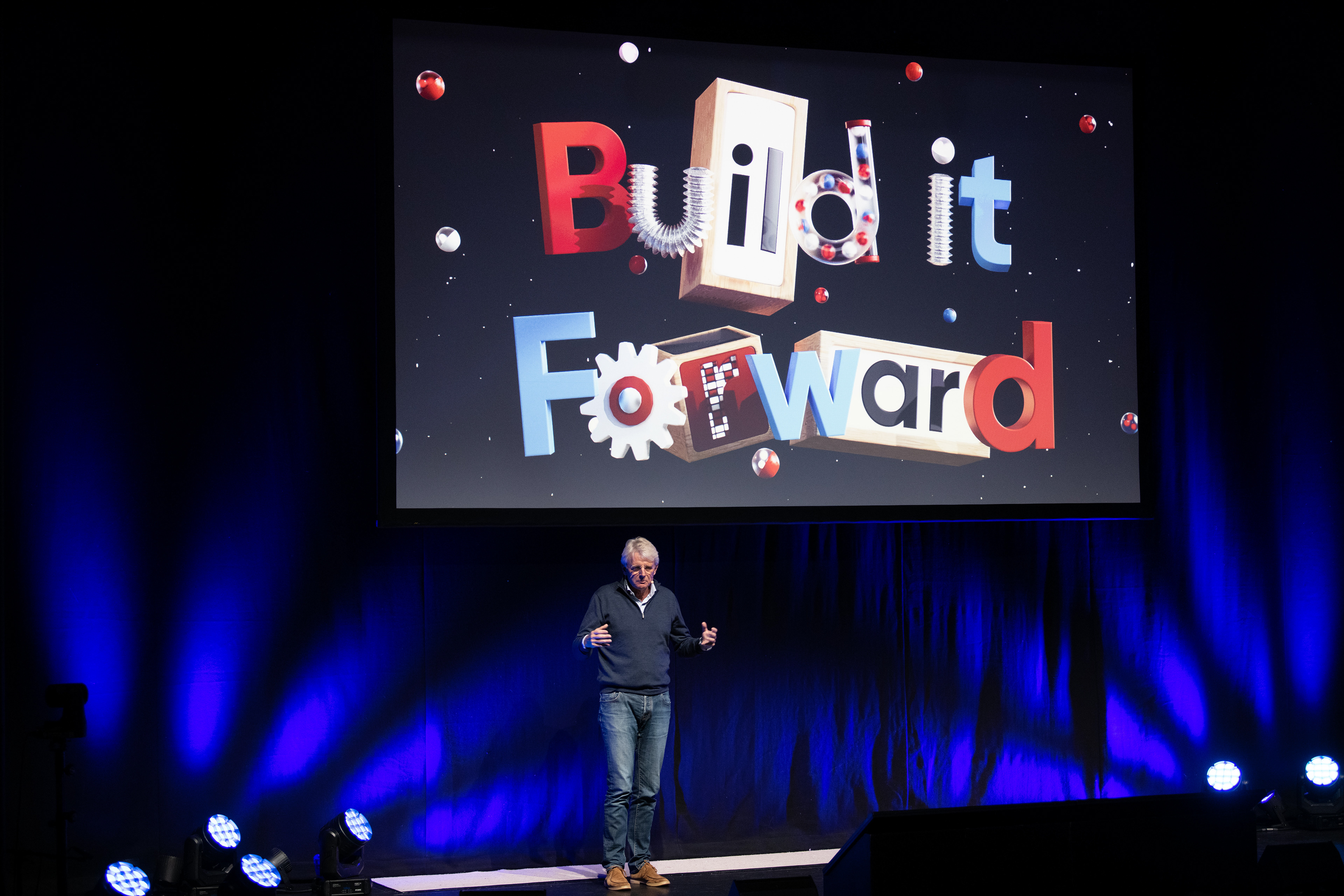
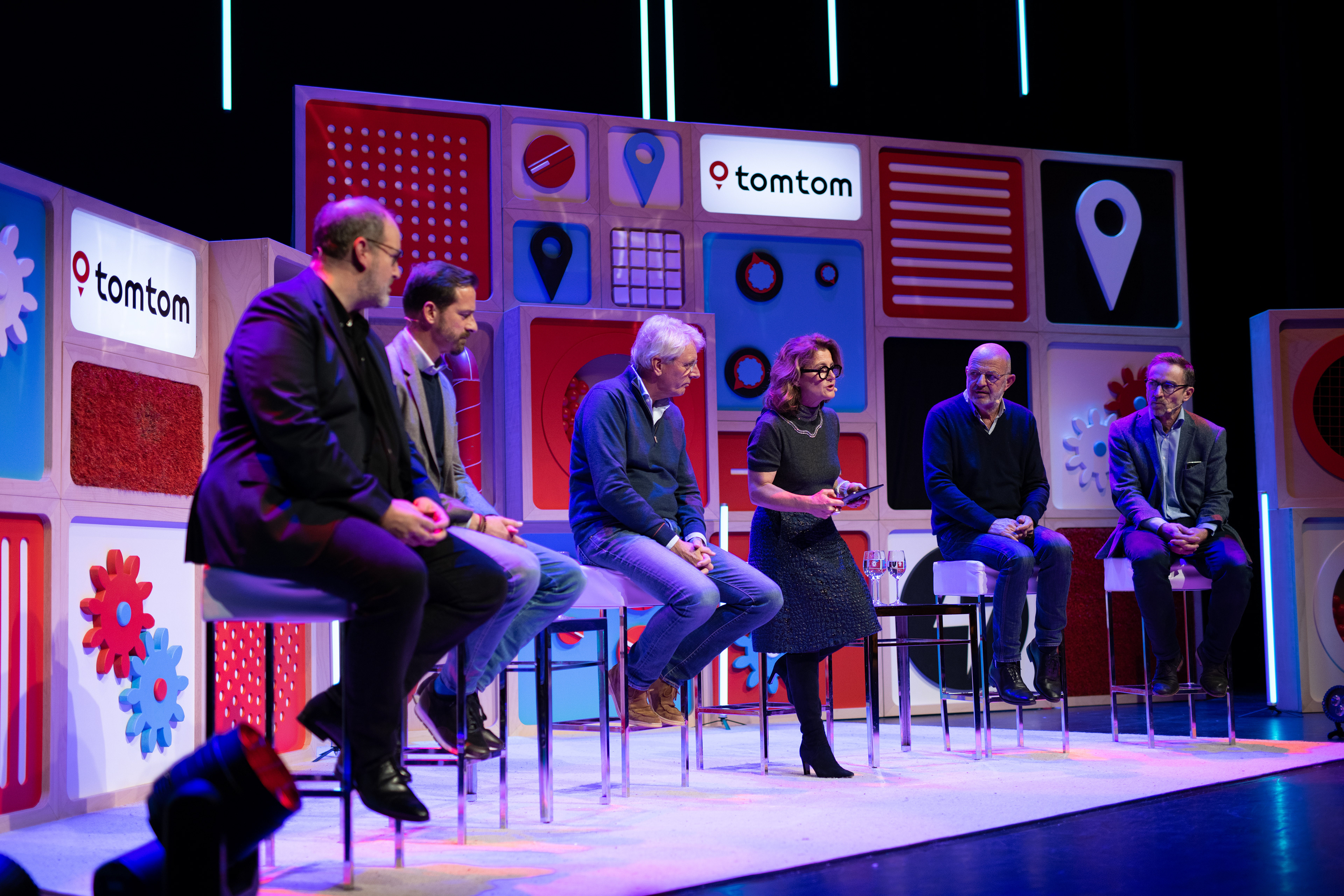
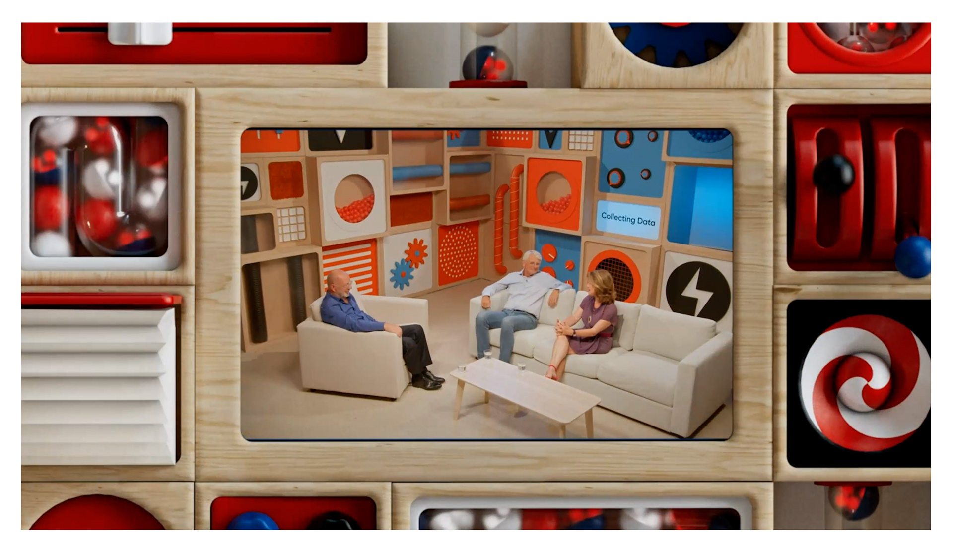
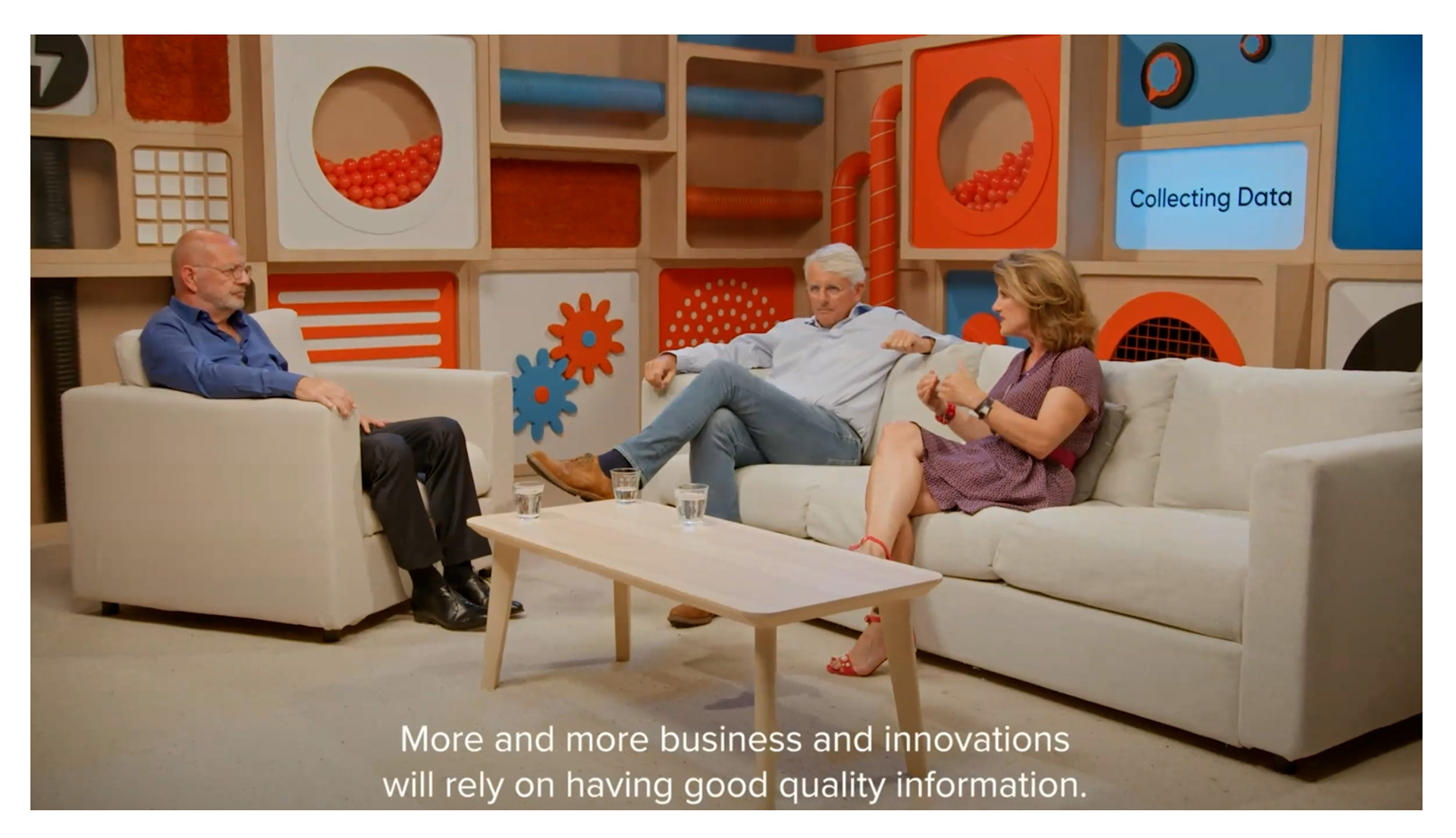
They enlisted me to create an overarching visual language that bound the whole event and documentary together, through 3 minutes of animated intros/outros to the documentary as well as shorter animated elements throughout the documentary and the logo title to the whole event, 'Build It Forward'. The basis of which then informed the set design for the documentary interviews, event stage design and branding.
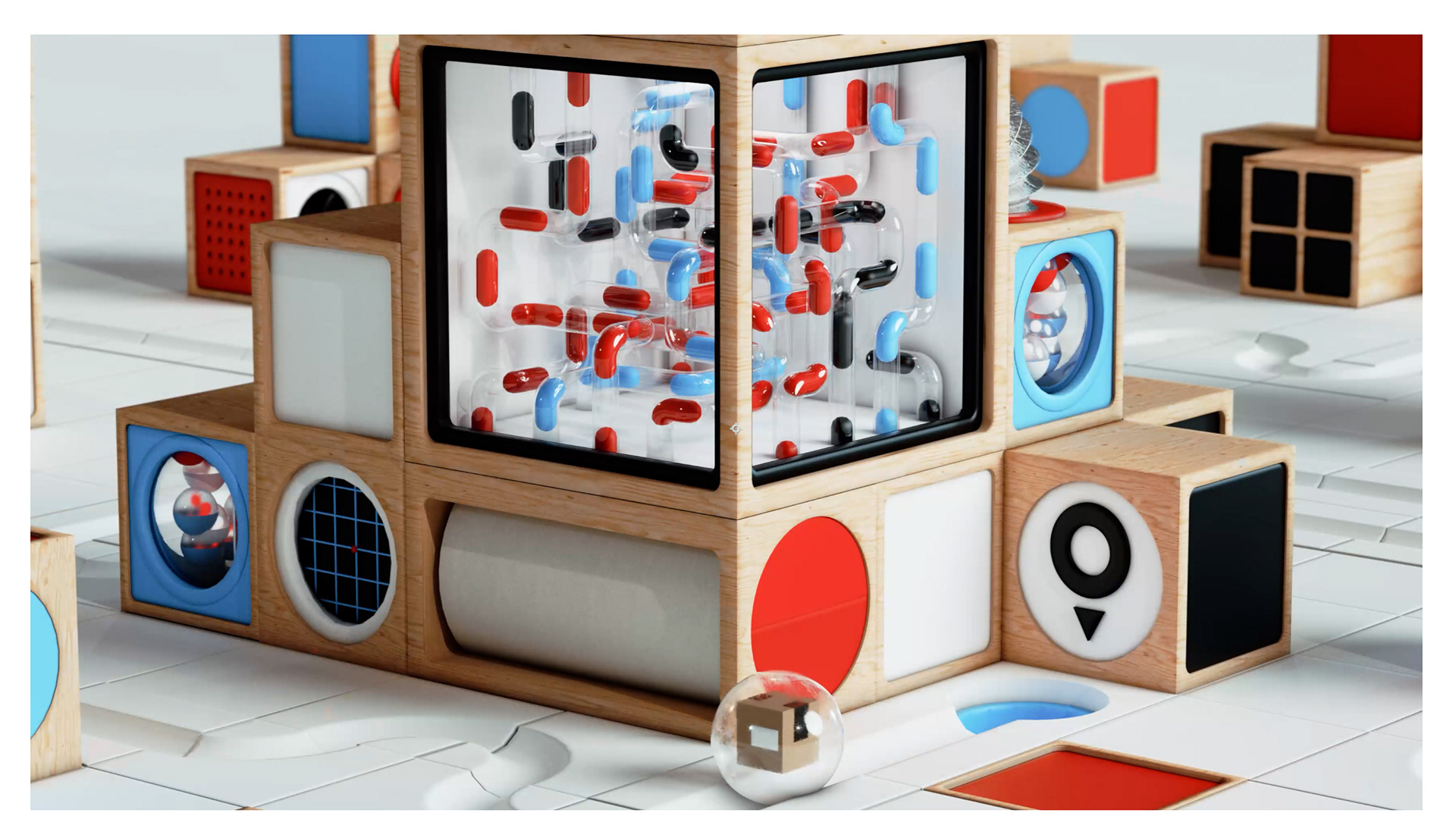
They loved my previous projects that featured whimsical contraptions, but wanted something that conveyed their data collection methods in a fun and engaging manner as well as the modular way in which their white label products underscore so much of the modern tech that keeps the global economy in motion.
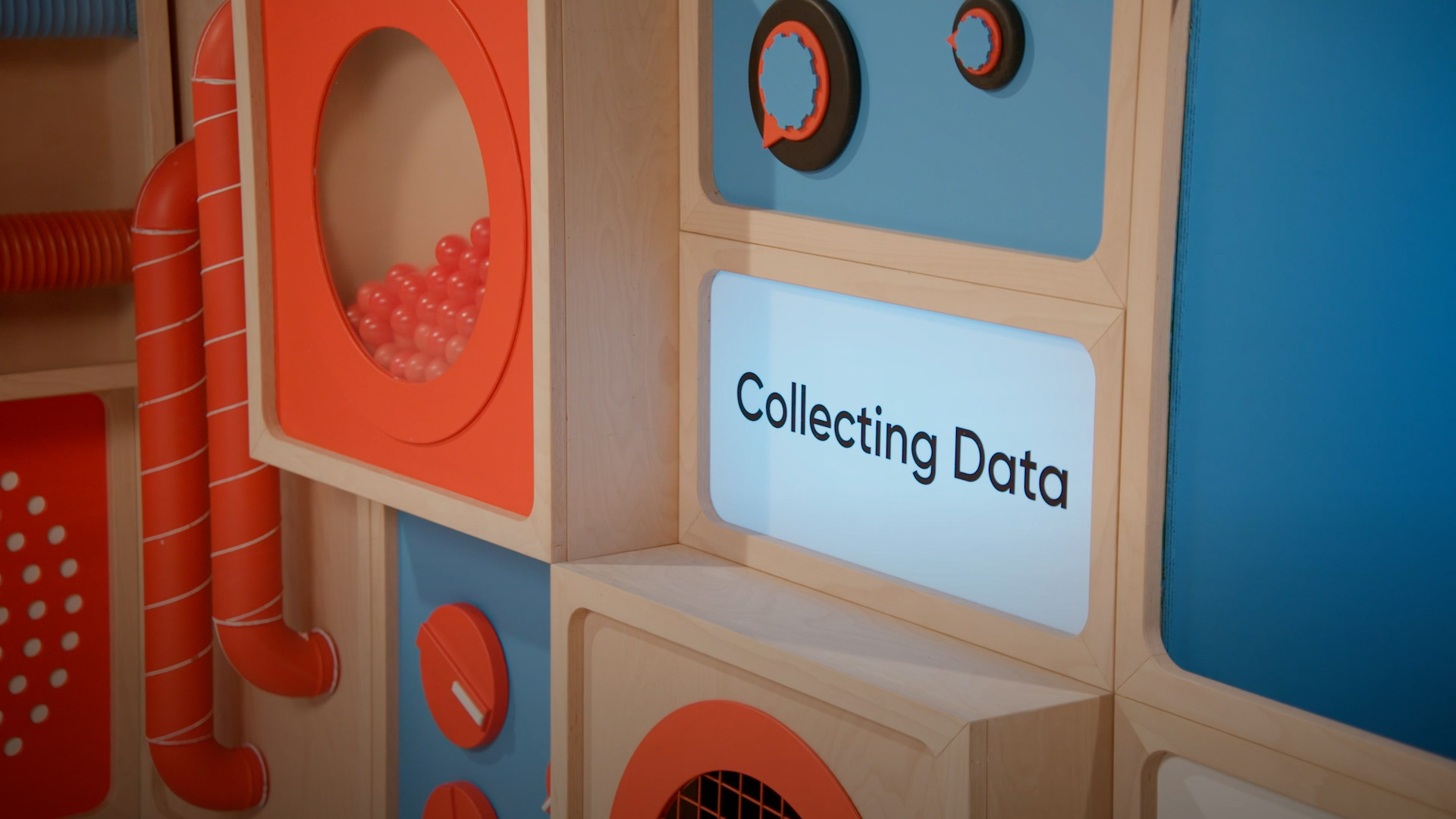
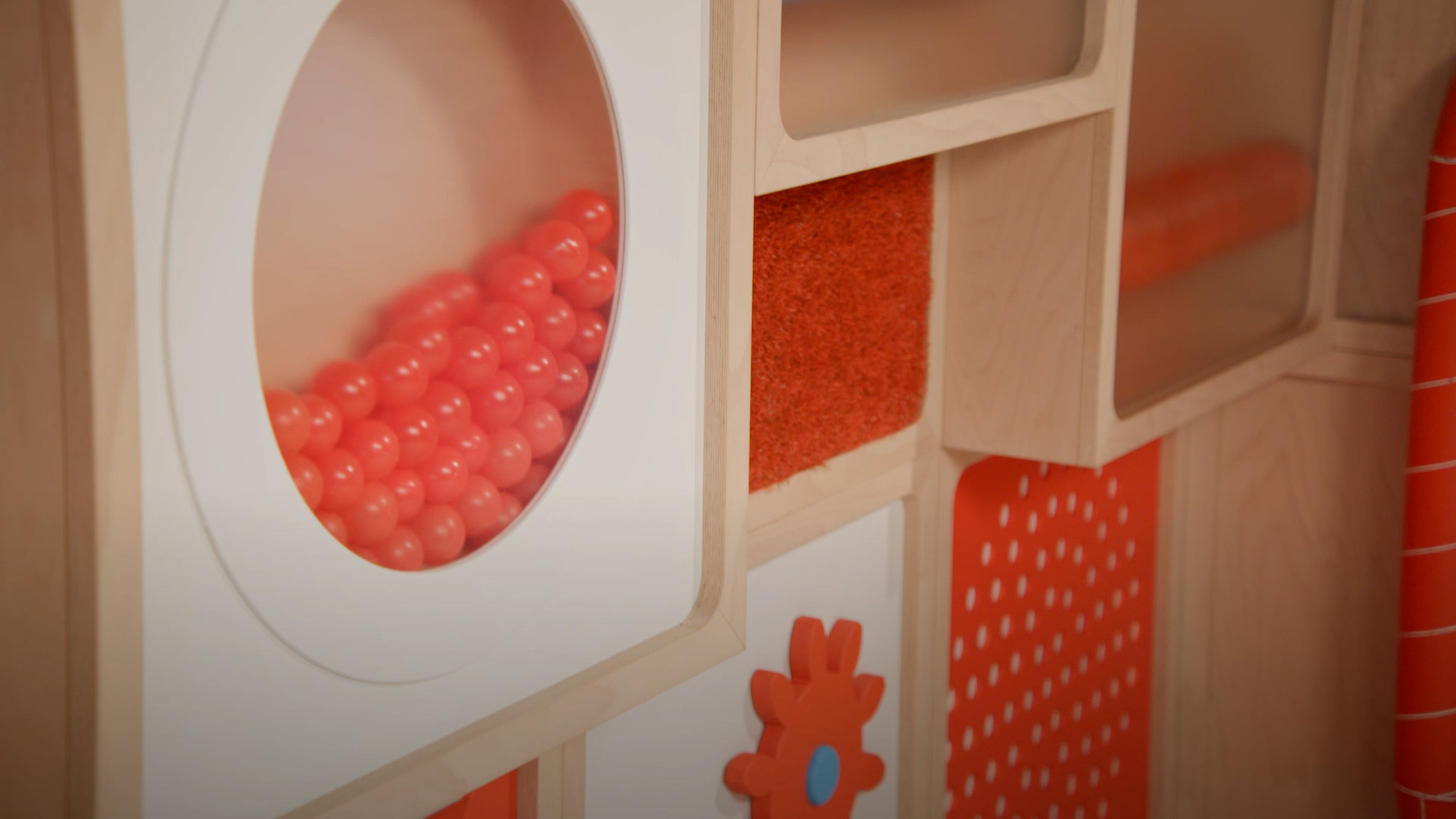
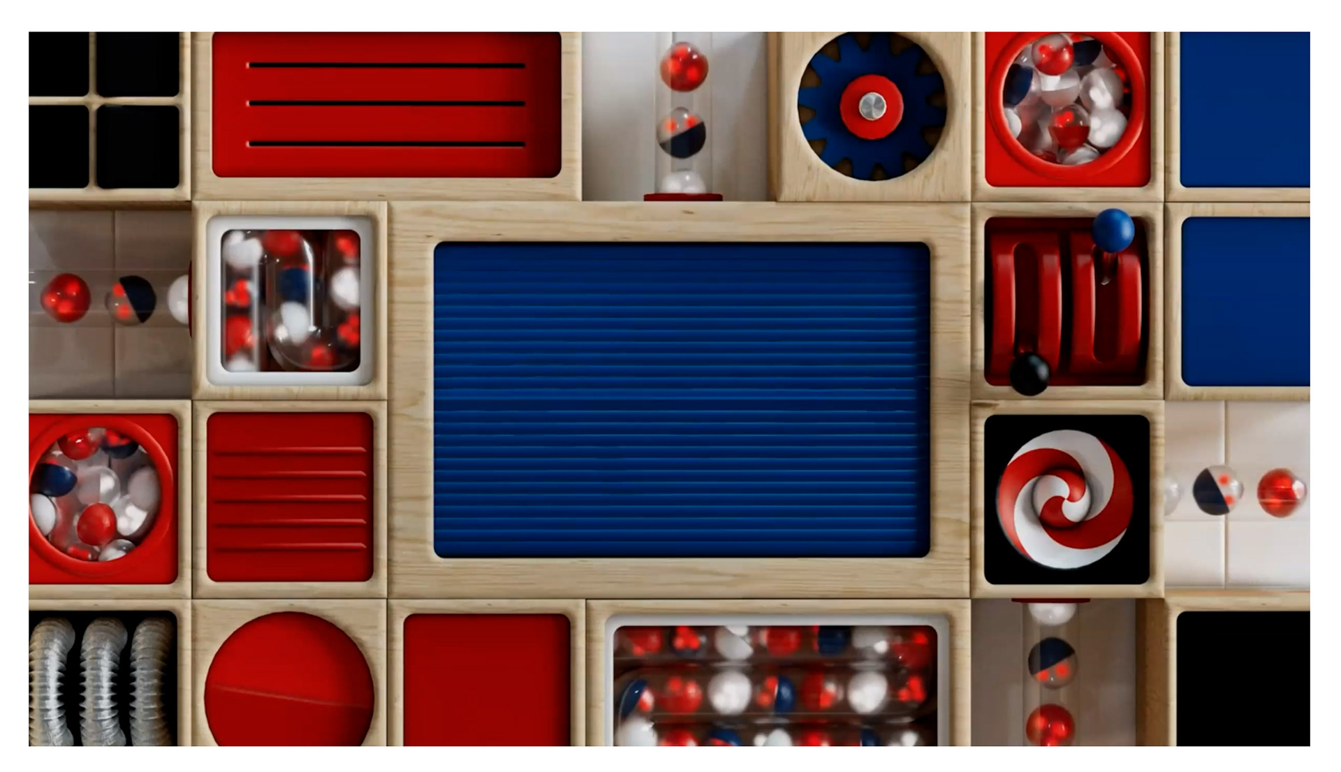
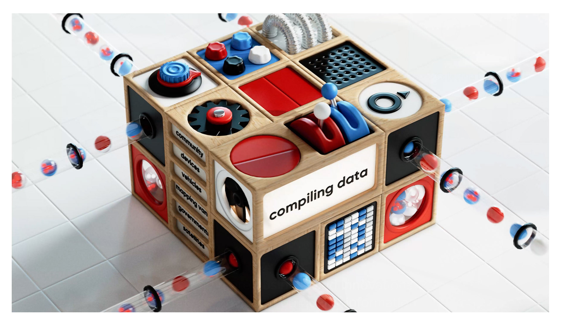
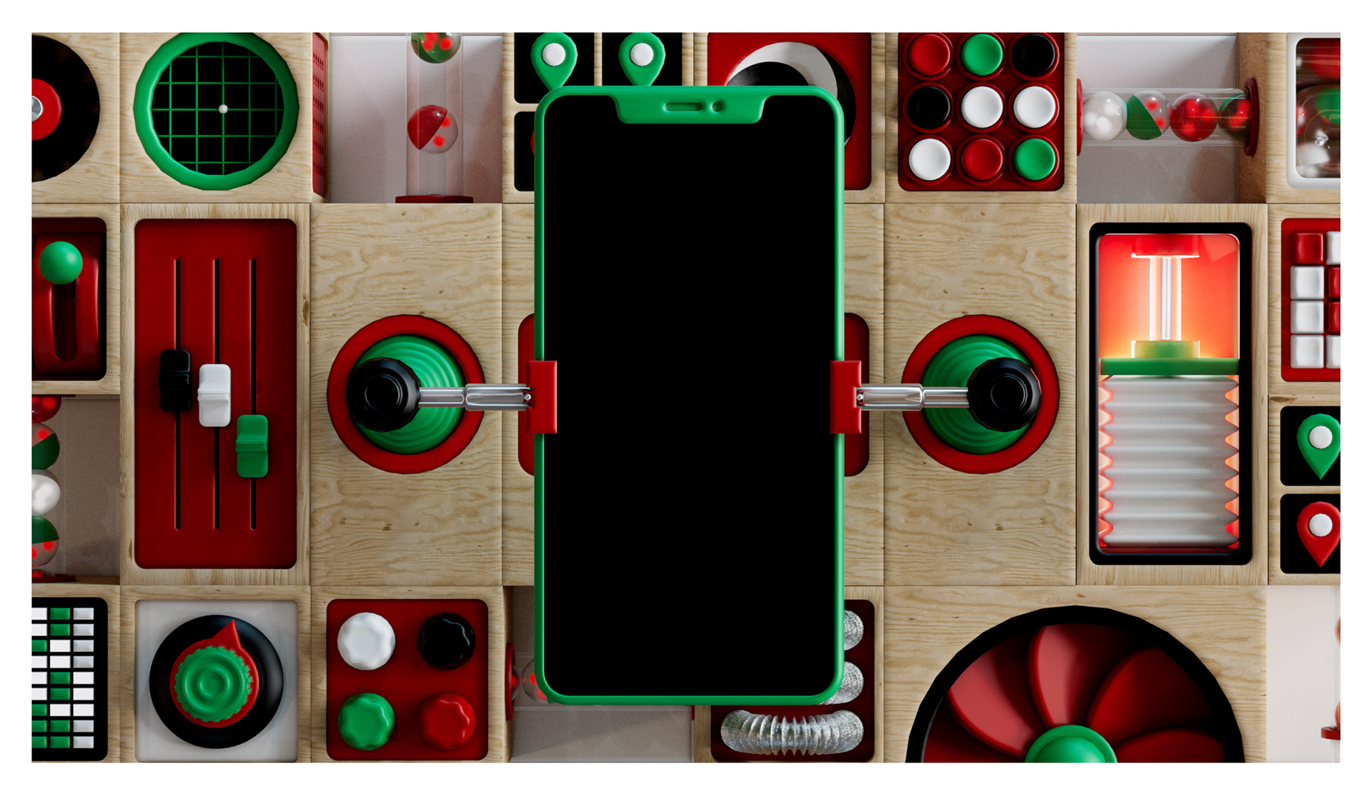
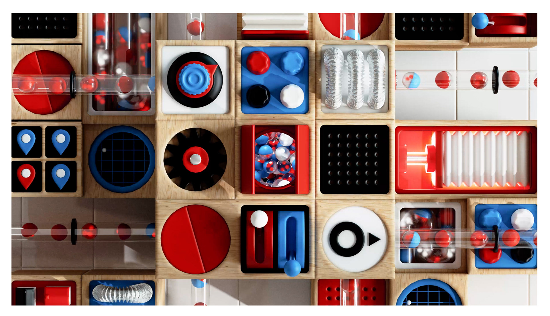
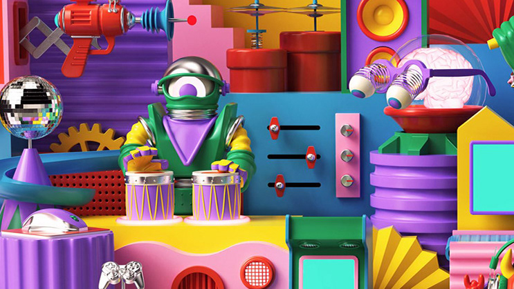
As time and budget was tight for such a large project, I devised a visual and animated system all based on the most integral part of any map; the grid. I created a series of different sized cubes, each containing a mini contraption, that when put together into different arrangements, formed larger contraptions throughout which flowed an endless stream of data. All within their brand color scheme and over all look & feel.
